# EChart常用配置整理
ECharts是一款功能强大的数据可视化JavaScript库,基于HTML5 Canvas。可以提供种类丰富、交互功能强大、数据视图直观的图表。本文整理了
ECharts的常用配置,不断更新!📝
参考资料:
# 1.存在多条纵轴
ECharts曲线-柱状混合图官方实例ECharts-Mixed Line and Bar (opens new window)
存在多条纵轴时要用yAxisIndex来标识当前的数据对应哪条轴,默认为0,就是左边这条纵轴。
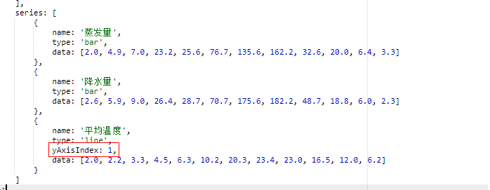
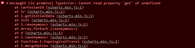
yAxisIndex不能乱标,否则会报下面的错误。
# 2.grid网格位置和dataZoom数据区域
const option = {
  ...
  // 网格位置 配置项文档:
  grid: {
    top: '10%',
    bottom: '10%',
    left: '5%',
    right: '5%',
  },
  // 数据区域
  dataZoom: [{
	  show: true
  }],
  ...
}
1
2
3
4
5
6
7
8
9
10
11
12
13
14
15
2
3
4
5
6
7
8
9
10
11
12
13
14
15
# 3.导出图表为图片
const myChart = echarts.init(document.getElementById('my-chart'));

const imageURL = myChart.getDataURL({// 获取base64数据
  type: 'png',
  pixelRatio: 2// 像素比
});

const link = document.createElement('a');
link.href = imageURL;
link.download = '统计图';
link.click();
1
2
3
4
5
6
7
8
9
10
11
2
3
4
5
6
7
8
9
10
11
# 4.设置大标题居中
title配置文档ECharts-option-title (opens new window)。
const option = {
  ...
  title: {
    text: 'xxxx统计图',
    textStyle: {
      color: '#000',// 字体颜色
      fontWeight: 700,// 字体粗细
      fontSize: 18,// 字体大小
      align: 'center',// 居中
      lineHeight: 20// 行高
    },
    left: 'center'
  },
  ...
}
1
2
3
4
5
6
7
8
9
10
11
12
13
14
15
2
3
4
5
6
7
8
9
10
11
12
13
14
15
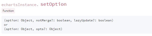
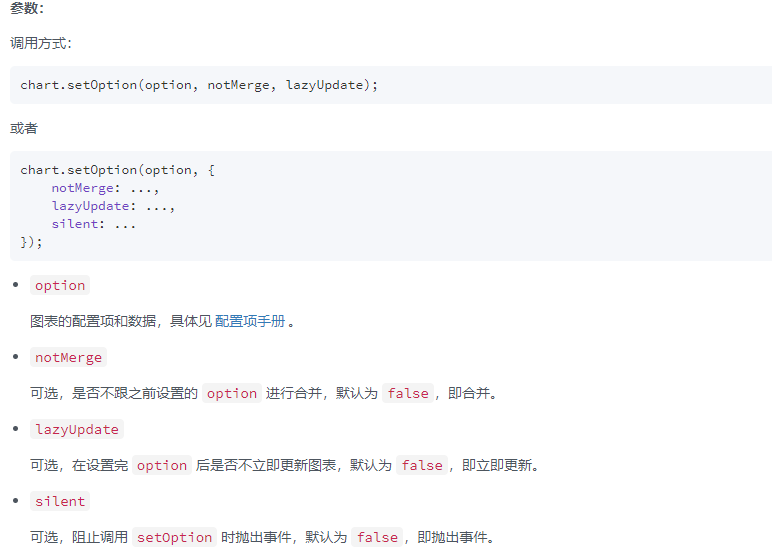
# 5.setOption()
chart.setOption(option, notMergen, lazyUpdate)。
WARNING
为了去数据串联,最好还是将notMergen设为true。
这样每次更新option的时候都不会与之前的合并。
# 6.横向柱状图(数据顺序从上到下)
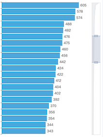
const option = {
  ...
  yAxis: {
    type: "category",
    data: yAxisData,// y轴坐标
    inverse: true// 倒序
  },
  series: [{
    name: "xxx",
    type: "bar",// 柱状图
    data: datas,
    barWidth: 14,// 柱状图📊的宽度
    itemStyle: {
      normal: {
        color: "#000",
        label: {
          show: true,
          // 在柱状图柱子顶部显示数值 如果是纵向柱状图,position为top
          position: "right"
        }
      }
    }
  }]
  ...
}
1
2
3
4
5
6
7
8
9
10
11
12
13
14
15
16
17
18
19
20
21
22
23
24
25
2
3
4
5
6
7
8
9
10
11
12
13
14
15
16
17
18
19
20
21
22
23
24
25
# 7.dataZoom锁定
有时候数据太多,而容器的大小有限,而此时数据又太多。所以可以锁定🔒
dataZoom滑块的长度,不让用户自由拖动改变其长度。
const option = {
  ...
  dataZoom:[{
    type: "slider",// 类型 “slider”
    show : true,
    orient: "vertical",// 设置dataZoom的摆放方式
    start: 0,// 设定滑块的起始位置
    end: 20,// 设定滑块终止位置 其实就是设置滑块的长度
    zoomLock: false// 锁定
  }],
  ...
}
1
2
3
4
5
6
7
8
9
10
11
12
2
3
4
5
6
7
8
9
10
11
12
# 8.图例显示更多信息
ECharts的图表的图例默认只显示颜色和对应的数据的名称,现实业务中需要的不仅仅是这些,可能还要显示数值、占比等信息。
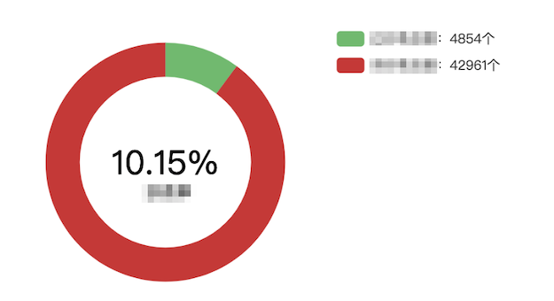
const option = {
  ...
  legend: {
    orient: "vertical",// 图例类型 -> 垂直
    right: "20%",// 图例位置
    top: "40%",
    data: legendData,
    formatter: function (name, count = null) {
      datas.some(item => {// 遍历datas获取数值
        if (item.name === name) {
          count = item.value;
          return true;
        }
      });

      return `${name}:${count}个`;// 使用字符串模板组装要显示的内容
    }
  },
  ...
}
1
2
3
4
5
6
7
8
9
10
11
12
13
14
15
16
17
18
19
20
2
3
4
5
6
7
8
9
10
11
12
13
14
15
16
17
18
19
20
# 9.轴线相关
const option = {
  ...
  xAxis: {
    type: 'category',
    data: xAxisData,
    // 坐标轴轴线
    axisLine:{
      show: false,
      lineStyle: {
        color: '#05A9CF'// 指定颜色
      }
    },
    // 坐标轴刻度线
    axisTick: {
       show: false
    },
    // 显示区域刻度线
    splitLine: {
       lineStyle:{
         color: '#05A9CF'// 指定颜色
       }
    }
  },
  ...
}
1
2
3
4
5
6
7
8
9
10
11
12
13
14
15
16
17
18
19
20
21
22
23
24
25
2
3
4
5
6
7
8
9
10
11
12
13
14
15
16
17
18
19
20
21
22
23
24
25
# 10.设置曲线阴影部分渐变
效果如下图所示↓:
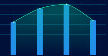
const option = {
  ...
  series: [{
    name: 'xxxxx',
    data: datas,
    type: 'line',
    smooth: true,// 是否顺滑
    areaStyle: {// 从这里开始
      normal: {
        color: new echarts.graphic.LinearGradient(0, 0, 0, 1, [{
          offset: 0,
          color: 'rgba(0,202,149,0.3)'
        },
        {
          offset: 1,
          color: 'rgba(0,202,149,0)'
        }], false),
        shadowColor: 'rgba(0,202,149, 0.9)',
        shadowBlur: 20
      }
    },
  }],
  ...
}
1
2
3
4
5
6
7
8
9
10
11
12
13
14
15
16
17
18
19
20
21
22
23
24
2
3
4
5
6
7
8
9
10
11
12
13
14
15
16
17
18
19
20
21
22
23
24
# 11.去除饼图标签和线
const option = {
  ...
  series: [
    {
      name: '访问来源',
      type: 'pie',
      radius: '55%',
      center: ['50%', '60%'],
      label: {
        normal: {
          show: false// 去除饼图标签和线
        }
      }
    }
  ]
  ...
}
1
2
3
4
5
6
7
8
9
10
11
12
13
14
15
16
17
2
3
4
5
6
7
8
9
10
11
12
13
14
15
16
17
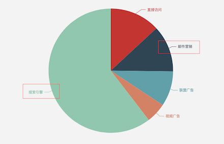
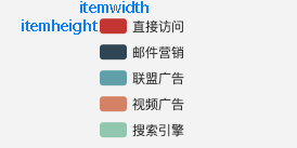
# 12.修改图例样式
const option = {
  ...
  legend: {
    orient: 'vertical',
    top: 'center',
    right: '0%',
    data: ['直接访问', '邮件营销'],
    itemWidth: 12,   // 设置图例图形的宽
    itemHeight: 9,  // 设置图例图形的高
    textStyle: {  // 图例文字样式
      color: '#fff',
      fontSize: 12
    }
  },
  ...
}
1
2
3
4
5
6
7
8
9
10
11
12
13
14
15
16
2
3
4
5
6
7
8
9
10
11
12
13
14
15
16
🍗 不断更新...