# 【CSS进阶】border-radius深入了解
如上图所示,最近碰见有个需求,需要实现上图效果。外面矩形好说,阴影部分犯了难了,不知为何,我看到第一眼居然是想用
canvas中的贝塞尔曲线画出来。。。最近在入门canvas。。言归正传,其实这个效果可以用纯CSS来实现,就是本节的主角
border-radius了。
# 1.border-radius的另一种形式
我们通常使用border-radius都是如下形式:
.style {
  border-radius: 5px;
}
2
3
这是一种简写形式,它是border-radius: 5px 5px 5px 5px/5px 5px 5px 5px的简写形式,就和padding还有margin是一样的道理。
但也有区别,border-radius的四个值是从左上角开始,顺时针环绕一圈,而padding和margin的四个值则是:上->右->下->左。另外,border-radius这种形式是一种比值形式。下面是一个例子:
<style>
  .circle {
    width: 200px;
    height: 400px;
    border: 2px solid #000;
    border-radius: 50px 50px 50px 50px/50px 100px 20px 0;
  }
</style>

<div class="circle"></div>
2
3
4
5
6
7
8
9
10
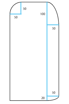
有了例子,基本上一目了然了,我们可以发现border-radius: 50px 50px 50px 50px/50px 100px 20px 0px其实可以翻译成:
border-radius: 左上角水平长度值 右上角水平长度值 右下角水平长度值 左下角水平长度值/左上角垂直长度值 右上角垂直长度值 右下角垂直长度值 左下角垂直长度值
# 2.使用border-radius实现前文需求
<style>
  .block {
    width: 300px;
    height: 200px;
    border-radius: 5px;
    display: flex;
    background-color: rgb(61, 148, 248);
  }

  .header {
    display: block;
    height: 40px;
    line-height: 30px;
    color: #fff;
    border-radius: 5px 0 0 0/5px 0 0 0;
    background-color: rgba(0, 0, 0);
  }
</style>

<div class="block">
		<span class="header">文字内容</span>
</div>
2
3
4
5
6
7
8
9
10
11
12
13
14
15
16
17
18
19
20
21
22
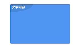
首先把该做的做了,把架子搭好。根据以上代码,不出意外的话,实现的效果是这样的⬇️。
接下来就根据本节中的第一小节的结论尝试实现曲线效果。仔细观察效果图可以发现图中要进行处理的角其实只有两个,分别为左上角和右下角。
那么现在将.header中的border-radius设置为5px 0 X 0/5px 0 Y 0,其中的X和Y暂时代表未知。
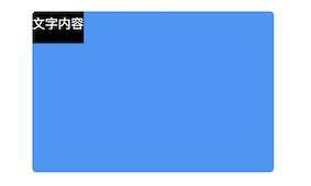
再次观察效果图,可以发现水平长度和垂直长度分别是这个span标签的宽和高,但是由于文字长度是不固定的,span标签的宽其实也是不固定的,此时可以设置x = 100%,那么Y = 40px。现在来看一下效果⬇️。

莫慌,给span加个内边距,控制一下最大宽度,然后调整一下背景的透明度。最终就可以实现首图的效果了,并且阴影部分是动态的,放代码。。。
<style>
  .block {
    width: 300px;
    height: 200px;
    border-radius: 5px;
    display: flex;
    background-color: rgb(61, 148, 248);
  }

  .header {
    display: block;
    height: 40px;
    line-height: 30px;
    color: #fff;
    padding: 0 40px 0 10px;
    border-radius: 5px 0 100% 0/5px 0 40px 0;
    background-color: rgba(0, 0, 0, 0.1);/* 不管底色怎么变,都是通透的 */
    max-width: 50%;/* 控制最大宽度 */
    overflow: hidden;/* 以下三个是控制超出部分省略 */
    text-overflow: ellipsis;
    white-space: nowrap;
  }
</style>

<div class="block center">
  	<span class="header">文字内容</span>
</div>
2
3
4
5
6
7
8
9
10
11
12
13
14
15
16
17
18
19
20
21
22
23
24
25
26
27
# 3.border-radius的其他特点
根据大佬的秘籍 (opens new window),border-radius还有两个特点,分别是大值特性和等比例特性,在此就不多说了其实是夜深了。。。,可参考大佬的秘籍。
参考资料: